Date
Have you ever needed to create a visualization of a research process or statistical model that isn’t directly plotted from data? For example, a conceptual diagram, mind map, flowchart of your research process, or statistical model diagram. The R package DiagrammeR makes it much easier to create high quality figures and diagrams in situations like these.
There are three main ways to use the DiagrammeR package:
- The package contains R functions that help you create a diagram. These include create_graph for defining the structure of your diagram, and render_graph for printing your diagram in the RStudio viewer. With render_graph you can also output your graph in DOT (graph description language).
- DOT is also used by Graphviz, which is implemented in DiagrammeR. Diagrams specified with Graphviz must pass a valid diagram specification in DOT to the function grViz(). At the minimum, you will need graph, node, and edge statements (see example below).
- The mermaid library is also implemented in DiagrammeR. Diagrams specified with mermaid must pass a valid diagram specification to the function mermaid(). You must begin by specifying graph in this function (see example below).
For exporting/printing/saving your diagrams, the package DiagrammeRsvg can be useful. You can also use the Export functionality in RStudio to save graphs.
library(DiagrammeR) ; library(DiagrammeRsvg) ; library(rsvg)
Example using DiagrammeR functions
A simple diagram:
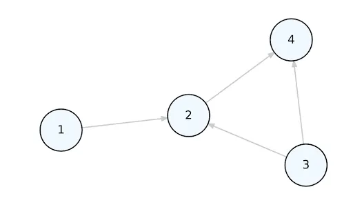
# define nodes dataframe
nodes <- create_node_df(n = 4,
                        type = "lower",
                        style = "filled",
                        color = "teal",
                        shape = "circle",
                        data = c(3.5, 2.6, 9.4, 2.7))

# define edges dataframe
edges <- create_edge_df(from = c(1, 2, 3, 3),
                        to = c(2, 4, 4, 2))

# create graph
my_graph <- create_graph(nodes_df = nodes, edges_df = edges)

# print graph
render_graph(my_graph)
Image
Use the export_graph function to save the figure as an image file, in this case a PNG:
# export graph
export_graph(my_graph, file_name = "simple.png",
             file_type = "PNG")
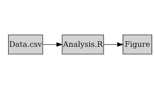
Research provenance example using Graphviz
I’ve found it easiest and most customizable to create diagrams using Graphviz.
A simple diagram:
my_graphviz <- grViz("digraph{

                     graph[rankdir = LR]

                     node[shape = rectangle, style = filled]
                     A[label = 'Figure']
                     B[label = 'Analysis.R']
                     C[label = 'Data.csv']

                     edge[color = black]
                     B -> A
                     C -> B

                     }")

my_graphviz
Image
A GraphViz object requires a few more steps to save as an image file, such as a PNG:
# export graph
export_svg(my_graphviz) %>%
  charToRaw() %>%
  rsvg() %>%
  png::writePNG("simple_grv.png")
A more complex diagram, specifying different colors for some nodes, and using subgraph clustering.
grViz("digraph{

      graph[rankdir = LR]

      node[shape = rectangle, style = filled]

      node[fillcolor = Coral, margin = 0.2]
      A[label = 'Figure 1: Map']
      B[label = 'Figure 2: Metrics']

      node[fillcolor = Cyan, margin = 0.2]
      C[label = 'Figures.Rmd']

      node[fillcolor = Violet, margin = 0.2]
      D[label = 'Analysis_1.R']
      E[label = 'Analysis_2.R']

      subgraph cluster_0 {
        graph[shape = rectangle]
        style = rounded
        bgcolor = Gold

        label = 'Data Source 1'
        node[shape = rectangle, fillcolor = LemonChiffon, margin = 0.25]
        F[label = 'my_dataframe_1.csv']
        G[label = 'my_dataframe_2.csv']
      }

      subgraph cluster_1 {
         graph[shape = rectangle]
         style = rounded
         bgcolor = Gold

         label = 'Data Source 2'
         node[shape = rectangle, fillcolor = LemonChiffon, margin = 0.25]
         H[label = 'my_dataframe_3.csv']
         I[label = 'my_dataframe_4.csv']
      }

      edge[color = black, arrowhead = vee, arrowsize = 1.25]
      C -> {A B}
      D -> C
      E -> C
      F -> D
      G -> D
      H -> E
      I -> E

      }")
Image
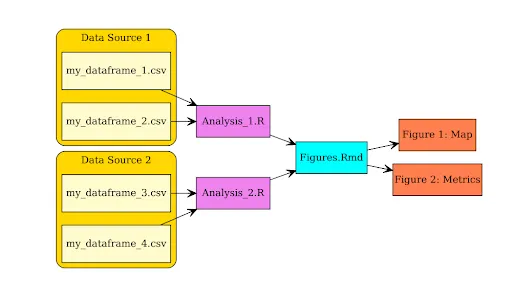
Adapted from a more detailed “real life” example located in this research data package.
Structural equation model example using mermaid
It’s also pretty easy to create diagrams in mermaid, but it seems slightly less customizable. It's also not currently possible to export a diagram created in mermaid to a static file (ex: svg, png). If you need to create a figure for publication, for example, it may be best to use the Graphviz implementation above.
A simple diagram:
mermaid("
        graph LR
        A[Nutrients]
        A-->B[Phytoplankton]
        B-->B1[Mussels]
        ")
Image

A more complex diagram specifying colors and shapes for nodes, and labels for edges.
mermaid("
        graph BT
        A((Salinity))
        A-->B(Barnacles)
        B-.->|-0.10|B1{Mussels}
        A-- 0.30 -->B1

        C[Air Temp]
        C-->B
        C-.->E(Macroalgae)
        E-->B1
        C== 0.89 ==>B1

        style A fill:#FFF, stroke:#333, stroke-width:4px
        style B fill:#9AA, stroke:#9AA, stroke-width:2px
        style B1 fill:#879, stroke:#333, stroke-width:1px
        style C fill:#ADF, stroke:#333, stroke-width:2px
        style E fill:#9C2, stroke:#9C2, stroke-width:2px

        ")
Image
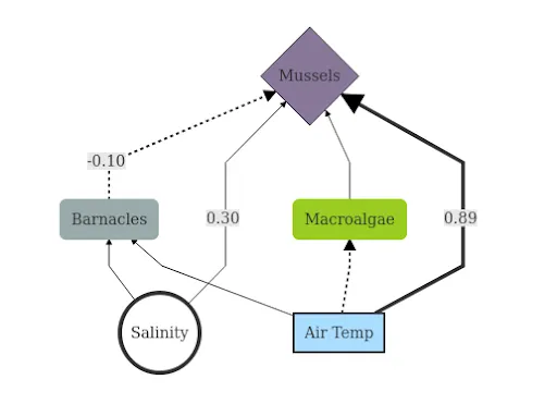
Adapted from Klinger & Blake (in prep.)
Share
Related Content
Build a Shiny App to Browse MODIS Data
ggplot Tricks Not to Forget About
The interactive visualization gap in initial exploratory data analysis
Article published in IEEE Transactions on Visualization and Computer Graphics