Date
Tweaking figures for presentations or publications can be a tedious process, especially when I always need a reminder on “how to use greek letters or subscripts in y-axis”, “remove legend”, and “r pch”. Here are a collection of some ggplot2 functions and arguments that I find particularly useful and want to remember.
Getting oriented with proper axes
Within an xlab() or ylab() function, use expression(paste()) to use special characters. Use brackets ([]) for subscript, the caret (^) for superscript, and the names of greek letters e.g. mu.
 ylab(expression(paste("C", H[4], " (", mu,"mol ", L^-1,")"))) +
  xlab(expression(paste("DOC (mg ", L^-1,")")))
- Customize date axes with scale_x_date()
- Rotate axis labels 90 degrees and right justify using the layer theme(axis.text.x = element_text(angle = 90, hjust = 1))
- Display axis tick labels as percentages with scale_y_continuous(labels = scales::percent). To round the percentages to the nearest whole number, use scale_y_continuous(labels = scales::percent_format(accuracy = 1)).
Show me the data!
Map aesthetics to specific shapes using scale_shape_manual() with arguments values and labels:
scale_shape_manual(values = c(21, 24),
                     name = element_blank(),
                     labels = c("Landsat", "Sentinel2"))
- As described in detail on the Cookbook for R website, vertically oriented error bars can be added to a plot using geom_errorbar(). The necessary aesthetics are ymin and ymax, and usually I adjust the width to 0.1 or 0.2. Use geom_errorbarh() with xmin and xmax for horizontal error bars (or rotate the whole plot with coord_flip()).
- Smooth out density plot using the adjust argument in geom_density
- Zoom in without losing outlier data points using coord_cartesian()
- Alternatively, lose the outliers on a boxplot with geom_boxplot(outlier.shape = NA)
Special text and labels
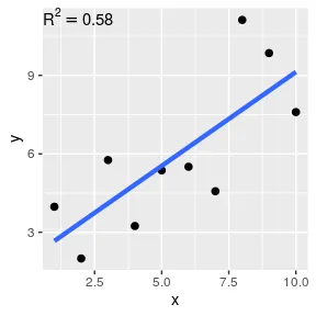
To display a statistic like R2 = 0.75 on a plot, it is better to code the value of R2 as a variable rather than manually typing it in. Here is how you can do this with ggplot’s annotate() function. You will need to include parse = TRUE as an argument so that the string is converted to a plotmath expression.
set.seed(222)
mydata <- data.frame(x = 1:10, y = 1:10 + rnorm(10, sd = 2))
fit <- lm(y ~ x, data = mydata)
rsq_label <- paste('R^2 == ', round(summary(fit)$r.squared, 2))

ggplot(mydata, aes(x = x, y = y)) +
  geom_point(size = 2) +
  geom_smooth(method = 'lm', se = FALSE, size = 1.5) +
  annotate(geom = 'text', x = -Inf, y = Inf, label = rsq_label, hjust = 0, vjust = 1, parse = TRUE)
Image
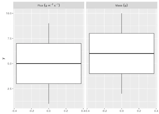
mydata <- data.frame(y = 1:10, variable = c('Flux~(g~m^-2~s^-1)', 'Mass~(g)'))
ggplot(mydata, aes(y = y)) +
  geom_boxplot() +
  facet_wrap(~ variable, labeller = label_parsed)
Image
Putting it all together
- For multi-panel plots, I like to “beef up” my plots using the cowplot package in R. It has an intuitive way to arrange panels and add annotation labels, which is described in one of the package’s vignettes.
The basic idea is to initiate an empty drawing canvas with the ggdraw() function, and then determined the location and sizing of each panel with draw_plot() functions.
If you have 4 ggplot objects called panel_a, panel_b, panel_c, and panel_d, creating a 4-panel figure with labels would look something like this:
figure <- ggdraw() +
  draw_plot(panel_a, x = 0, y = .5, width = 0.4, height = 0.5) +
  draw_plot(panel_b, x = .4, y = .5, width = 0.6, height = 0.5) +
  draw_plot(panel_c, x = 0, y = 0, width = 0.4, height = 0.5) +
  draw_plot(panel_d, x = .4, y = 0, width = 0.6, height = 0.5) +
  draw_plot_label(label = c("a", "b", "c", "d"), x = c(0, 0.4, 0, 0.4), y = c(1,1, 0.5, 0.5), size = 15)
The arguments for the draw_plot function are:
- plot: the plot to place (ggplot2 or a gtable)
- x: The x location of the lower left corner of the plot.
- y: The y location of the lower left corner of the plot.
- width, height: the width and the height of the plot
There is also a handy function for saving this type of plot to a file:
save_plot("figure.png", figure, ncol = 2, nrow = 2, base_aspect_ratio = 1.3)
As I haven’t determined anything particularly bovine-related in the package, I’m pretty sure the name references the author’s initials.
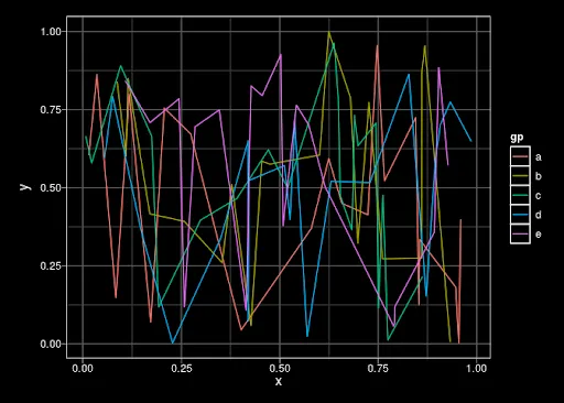
- If you want a “stealth mode” plot that is all black with white lines and text, there is no built-in theme in ggplot and it’s oddly hard to find a good white-on-black theme in any of the add-on packages that have customized themes.
The best one I have found is written by Jon Lefcheck and can be sourced directly from GitHub:
source('https://gist.githubusercontent.com/jslefche/eff85ef06b4705e6efbc/raw/736d3dc9fe71863ea62964d9132fded5e3144ad7/theme_black.R')

mydata <- data.frame(x=runif(100), y=runif(100), gp=letters[1:5])
ggplot(mydata,aes(x = x,y = y, color = gp)) +
  geom_line() +

  theme_black()
Image
Share
Related Content
Making Free Maps with R, ggspatial, and Mapbox
Creating Visualizations with DiagrammeR
The interactive visualization gap in initial exploratory data analysis
Article published in IEEE Transactions on Visualization and Computer Graphics