Date
Following up on Kelly H’s recent excellent blog posts on accessibility in Shiny apps, I’d like to tell a little story that illustrates how R helps make open science and reproducibility possible. After all, accessibility also includes making it possible for other community members to use and benefit from work you’ve done. We had a problem which was solved with the help of the R community, and I was able to get more bang for my buck: the work I did is now part of a package that anyone can access. That’s more efficient and speeds the pace of research! This is only possible with the community of great people that work on R — they are often willing to donate their time free of charge to help other people solve problems.
Image
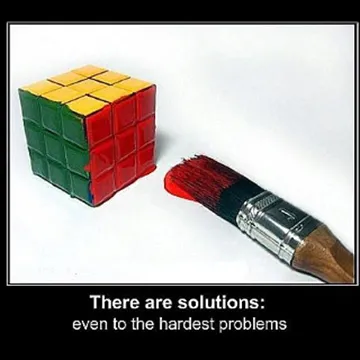
"Rubik's Cube" via motleynews.net
The story started when Nicole Motzer and her collaborator Bethany wanted people to be able to better visualize the results of their review of studies that assess outcomes of interdisciplinary research. They had already categorized over 1000 cases of interdisciplinary collaboration with about 15 different attributes. Some of the attributes could have two values, while others could have over a dozen. It’s hard to visualize all that at once. So I took a static graph that Kelly H made, and turned it into an interactive visualization. It’s a Shiny app that you can check out on the SESYNC server.
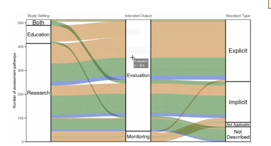
Image
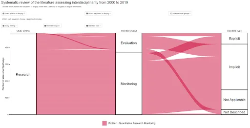
Screenshot from the app
The visualization centers around a flow diagram, variously known as a Sankey diagram or an alluvial plot. Most likely you have seen one of these diagrams before when learning about Earth’s energy balance. For a more historical example, you might be familiar with one of the most famous data visualizations in history, a flow diagram of Napoleon’s military misadventure in Russia. (Or take a look at more examples of flow diagrams in R.)
Image
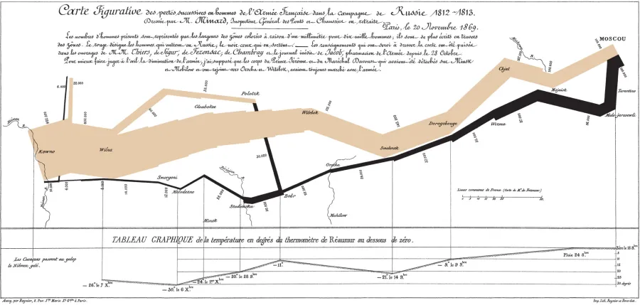
Minard’s famous flow diagram of Napoleon’s invasion of Russia
Image
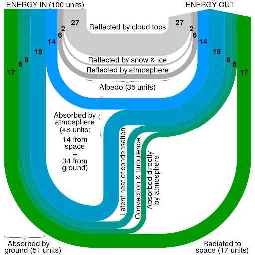
Earth’s heat balance, original data from Kiehl & Trenberth 1997
I tried out a number of different ways of making an interactive flow diagram. I ran into the issue where we liked the look of the flow diagram made with the ggalluvial package the best, but liked the feature on googleVis where you can hover over the plot and get information in a “tooltip” about what you’re hovering over.
So I wrote up a bit of a hacky way to enable information to pop up when you hover with your mouse over a ggalluvial plot. It involves using the coordinates of the mouse pointer and the polygons defining the “swoopy loopy” flow paths in the flow diagram to calculate whether the mouse is hovering over a flow path, one of the node boxes connecting the flow paths, or neither. A little box appears next to the mouse pointer showing information about the path or node that the mouse is hovering over.
Image
The app in action!
There were a lot of little headaches involved in figuring out how to get this to work just so, which I won’t go into detail about. I had to contact Cory, the developer of the package, for help while I was working on it. I did this by opening an issue on the package’s GitHub repository. I ended up having to go into the source code of the ggalluvial package to figure out exactly how the graphics were being drawn, and how to extract that information so that the app could use it to associate the mouse’s location with information from the underlying plot data. After lots of trial and error, it works!
After I was done, he encouraged me to write a vignette about it (an article with an example of how to use an R package, that is part of its documentation for users). We thought my experience might benefit people in the future who want to make interactive visualizations similar to mine. Hopefully now they will not have to do all the trial-and-error hacking I did! So I took his advice and wrote a vignette, then created a pull request out of it (That’s git lingo meaning I submitted my changes to the code in his package repo, in the hopes he would approve the request and incorporate my changes into the “official” version of the package.) After some editing back and forth, he accepted the PR and the vignette is now part of the package!
This demonstrates quite a few nice things about open, reproducible research: I could easily combine code from a couple different packages to get the result I wanted, I could delve into the source code of the R packages and see exactly how everything works, I was able to communicate with the developer to get help, and I was able to get more mileage out of the work I did because it is now benefiting others that might want to do the same thing, saving them the headaches I had to go through! Altogether this is a major endorsement for open interdisciplinary science and reproducibility with R.
Share