.jpg)
Date
Overview
Image
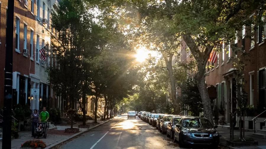
Unaltered image by William W. Ward via Wikimedia, 2.0.
A downloadable version of this lesson is available here:
Document
Lesson – Redlining & Treecover.pdf
(901.49 KB)
In the mid 1930s in the United States, the federal government established the Home Owners’ Loan Corporation (HOLC) to support reinvestment in housing after the Great Depression. In coordination with local real estate professionals, the HOLC mapped and graded 239 cities based on their estimate of the loan risk for a given area, with the most desirable neighborhoods outlined in green and the least desirable in red [Burghardt et al. (2022), p. 2]. Thus began the practice of “redlining”—where inequitable access to investment funds followed demographic patterns, with Black, Jewish, and immigrant neighborhoods most likely to be redlined. This codification of environmental racism had effects that are still visible today: historically redlined neighborhoods often have higher housing density, more dilapidated structures, and fewer trees and parks, and they are often hotter and suffer more air pollution. In their groundbreaking study of tree cover in Baltimore, Burghardt et al. found that a viable location for trees is nine times more likely to have a large tree in a greenlined neighborhood than in a redlined one (p. 7).
This lesson is a simplified, web-based exploration of the residual effects of redlining on neighborhood tree cover and species diversity in the city of Baltimore. Using online databases for redlining maps and tree surveys, learners will explore contrasting neighborhoods in Baltimore to better understand how historical inequality endures to this day and how cities may implement proactive measures to increase environmental equality across a metropolitan area. If these resources are available for your city, instructors may adapt this lesson to explore redlining and tree cover correlations in your region.
Assumed Prior Knowledge
Appropriate for undergraduate, graduate, and higher-level learners. This lesson has the potential to grow into an applied thesis project for a master’s or doctorate degree.
Learning Objectives
- Explore redlining maps that show how Baltimore was assessed for investment nearly a century ago and how those biased judgments have effects that are still visible today.
- Conduct web-based quantitative surveys of tree size, quantity, and diversity in greenlined and redlined locales.
- Make qualitative assessments of each neighborhood’s aesthetics and blend them with quantitative measures to generate a review of each neighborhood’s green amenities.
- Present qualitative and quantitative information to create a set of recommendations that you may introduce to residents, city planners, and managers.
Key Terms/Concepts
redlining; environmental racism; environmental justice; green infrastructure; disinvestment; quantitative methods; qualitative methods; heat islands; demographics; community composition; ecosystem services; housing policy; street trees; urban biodiversity
The “Hook” (suggestions for quickly engaging students)
Image
Does tree size matter?
For 2 minutes, ask learners to jot down the environmental quality distinctions between a neighborhood with small, sapling trees and one with large, mature trees. How does the provision of ecological services, aesthetics, and neighborhood character differ between new- and old-growth street trees? Why does the diversity of species matter? Then for 3 minutes, discuss these distinctions of size and species. Learners may perceive that recent tree-planting regimens that over-rely on a single species not only provide fewer services to humans and other creatures, but they are more susceptible to die off from pests and aesthetic redundancy. The simple quantity of trees on a block is not an adequate measure of environmental benefits or health, and it takes decades for tree-planting regimens to pay off for local residents.
Teaching Assignments
Redlining and Tree Cover: Measuring Environmental Inequality in Baltimore (Two, 75-minute classes)
-
As preparation for the session, have learners read the article by Burghardt et al. (2022), paying special attention to the highlighted portions. Learners should also preview the redlining maps and introduction to redlining provided by the University of Richmond, which covers hundreds of cities across the country. Learners may be interested in browsing redlining maps from cities they know or live near, but this lesson will focus on the Baltimore map, specifically the redlined area D-4, and the greenlined area A-1. Also have learners preview the Baltimore Street Tree Inventory, a resource that provides tree species, size, and placement data across the city.
-
(10 min.) After The Hook above, begin the lesson by reviewing these Lesson PPT slides.
Document -
(15 min.) Display the redlining map of Baltimore for the whole class to view. Divide the class into two groups: “greenlined” and “redlined,” and then subdivide into a total of four to eight small groups of three to four learners each. Each group will focus on a sample of trees along ~2,000 ft. of the street. Have learners open their browser windows to the Baltimore Street Tree Inventory and the city of Baltimore in Google Maps, which can help them navigate the region and provide street view images with which learners may assess the aesthetics of their assigned locale. Assign groups to these areas:
Greenlined neighborhood (A-1) (Note: To find these addresses in the Street Tree Inventory, search for Purlington Way.)
- Taplow Road, from North Charles St. to Purlington Way
- Saint Dustan’s Road, from North Charles St. to Purlington Way
- Witherspoon Road, from North Charles St. to Purlington Way
- More cross streets between North Charles and Purlington, or the neighborhood’s north-south routes totaling ~2,000 ft. of street front, as needed based on group number.
Redlined neighborhood (D-4) (Note: to find these addresses in the Street Tree Inventory, search for Smithson St.)
- Riggs Avenue, from North Gilmor St. to North Arlington Ave
- West Lafayette Avenue, from North Gilmor St. to North Arlington Ave
- West Franklin Street, from North Gilmor St. to North Arlington Ave
- More cross-street between Gilmor and Arlington, or the neighborhood’s north-south routes totaling ~2,000 ft., as needed.
-
(15 min.) Allow small groups to zoom in on their assigned neighborhood in Google Maps and assess its overall appearance (street view) and nearby dis/amenities (industry, highways, parks, schools). Note: The redlined region sits just north of the infamous “Highway to Nowhere” (U.S. Route 40) that bisected a lively Black neighborhood when it cut through the city in the 1970s. The greenlined region is proximate to a number of private schools, universities (including Johns Hopkins), and parks. These two neighborhoods also have contrasting housing densities: the greenlined is single-family homes with yards, and the redlined is rowhouses with little-to-no yard space. Have learners take notes on these qualitative features and consider how they may affect quality of life and health in the local region. They may also wish to capture screenshots of street views. These notes will be important for the presentation in session two.
-
(30 min.) Now, have learners use the Street Tree Inventory to conduct a quantitative analysis of street tree placement, abundance, size, and diversity along their ~2,000-ft. street sample. Using a spreadsheet, groups should type data on street trees including Diameter at Breast Height (DBH); designation of small (DBH <5 in.), medium (DBH 5–20 in.), and large (DBH >20 in.); tree height; and species. They should also note stumps (black circles), vacant unsuitable tree spots (crossed-out red circles), and vacant suitable spots (green plusses). Once all data is entered, calculate the following quantitative information: number of trees; number of species; average DBH and height; distribution of small/medium/large; number of vacant spaces (both suitable and unsuitable). This exercise will take the remainder of this class period. Any groups that have not finished should complete the work as homework. Note the tree inventory database tools: Under each tree’s entry, click on the three dots at the bottom to access an attribute table that lists all trees within each category and allows users to place markers on exceptional specimens they may wish to note in their presentation.
-
(15 min.) In the next class session, reconvene the groups and have them review the quantitative and qualitative information on their assigned street. Each group will have 15 minutes to prepare a short (~5-7 min.) slide-based presentation of their findings to the whole class. While the exact format is up to their discretion, each presentation should provide quantities textured by qualities of their street and make specific observations about how certain factors such as housing, proximity to dis/amenities, and city investment (including new tree planting programs) affect their perception of this street’s quality.
-
(~40 min.) Each group now has the opportunity to present their findings and field questions. Have all the greenlined groups go first, then the redlined groups. All groups should upload their quantitative spreadsheet into a shared course space, for everyone’s access.
-
(20 min.) Finish this lesson with a whole-group discussion of the residual effects of redlining. The instructor may wish to emphasize certain points, such as the importance of tree species diversity (in an ecology class) or how housing type affects access to green space (in an urban-planning class). Be sure to discuss any surprises (the redlined street has more trees than the greenlined one!); strategies that cities may adopt to redress inequalities—such as investing in tree planting in public park space and public schools in redlined neighborhoods or narrowing car traffic lanes (hardscapes) to make room for street trees and other green infrastructure in blemished blocks. What are the best two or three ideas for improving the environmental quality of the most disinvested areas? How would you approach residents to seek feedback on tree planting ideas and ask for further suggestions?
-
As an optional extension, summarize and present the whole class dataset to Baltimore city planners, local community organizers, and nature-enthusiast groups. This project could easily be adapted to your city, provided the kind of tree database information that Baltimore has. It could also grow into a master’s or doctoral thesis applied project that targets tree programs for legacy blighted, redlined neighborhoods.
Background Information for the Instructor
-
Variation in experiences of nature across gradients of tree cover in compact and sprawling cities
This article examines residential attitudes toward urban green cover from sprawling settlement patterns (Brisbane, Australia) to compact ones (three U.K. cities). The authors explore how the extent of greenness affects the experience of nature and feelings of connection to nature. The study finds that reduced access to green spaces also reduces residents’ feelings of “Nature Relatedness.” These findings imply that planning urban green space in the interstices of cities is important to supporting nature connectedness and its related health and ecological benefits.
Shanahan, D.F., Cox, D.T.C., Fuller, R.A. et al. (2017). Variation in experiences of nature across gradients of tree cover in compact and sprawling cities. Landscape and Urban Planning, 157, 231-238. https://doi.org/10.1016/j.landurbplan.2016.07.004
-
Variation in estimates of heat-related mortality reduction due to tree cover in U.S. cities
This article takes an environmental justice and public health perspective to model how a 10% increase in urban tree cover would result in reduced heat-related mortality in U.S. cities with a variety of climactic and demographic conditions. Climate change scenarios predict the highest increases in heat-related mortality in cooler cities that experience intensified summer heat waves, such as Minneapolis. These findings have important implications for climate adaptation planning and public health policy, as well as initiatives that support urban tree planting.
Sinha, P, Coville, R.C., Hirabayashi, S. et al. (2022). Variation in estimates of heat-related mortality reduction due to tree cover in U.S. cities. Journal of Environmental Management, 301(1), 113751. https://doi.org/10.1016/j.jenvman.2021.113751
-
How America’s hottest city is trying to cool down
This engaging short film from Vox Media profiles Phoenix, AZ as a city with extreme climatic heat pressures, extensive hardscapes that absorb and radiate heat, and environmental justice inequities. The 7-minute film diagrams how the retrofitting of neglected spaces with trees and groundcover may reduce these inequities and increase livability even as climate change intensifies the challenges to residents of America’s hottest city.
Vox. (2021, September 20). How America's hottest city is trying to cool down [Video]. YouTube. https://www.youtube.com/watch?v=ZQ6fSHr5TJg&pp=ygUMdXJiYW4gdHJlZXMg
Share